Tuesday, 14 August 2018

Hire 22 Bury St Gallery for your Exhibition or Event


A Unique Art Gallery in St James

22 Bury Street Gallery offers a unique and friendly exhibition space, ideal for solo, group and pop-up shows and located in heart of the world-famous St James’s art district of central London. The gallery is well situated neighbouring Christie’s as well as many internationally famous art galleries exhibiting all ranges of artwork from cutting-edge Contemporary,  to Old Masters and Asian art. 

Venue Hire Includes:

  • Affordable and flexible exhibition space on the ground floor and mezzanine.
  • Extensive window and gallery street frontage overlooking to the destination shopping district of St James's
  • Options for window letting and design.
  • Private view evenings and events, plus freedom of opening hours as desired.
  • Telephone line, and an extra dedicated line for credit card terminals (card terminals not supplied).
  • Kitchen and WC areas downstairs (not a display area).
  • No commission charged on the sale of artwork.


Available on Request:

  • Wifi
  • PC
  • Printer
  • Hanging service
  • Display materials (lighting system, blocks, bookshelves, acrylic notice displays etc)
  • Bespoke framing service
  • Catering staff, food and drinks.


The Gallery

The modern exhibition space is situated on the ground floor with extra hanging opportunities on the mezzanine, which can be made available. The space possesses an impressive frontage on to the street, within direct view of the well-known shopping precinct of Jermyn Street. Bury Street benefits from strong daily foot fall from both international visitors as well as the many businesses in this quarter, specialising in finance, fashion and art.


How to Find Us:

Conveniently situated a few minutes’ walk from both Green Park and Piccadilly Circus underground stations with good access by car and bus (9, 14, 19, 22,38 to Green Park), and a short walk from Royal Academy and The National Gallery.

Car Parking available directly outside the gallery (Pay By Phone).

Find our location on Google Maps here.


Costs:

Day rate: £1000 + vat
Week rate: Ground floor: £5500 + vat / Ground & mezzanine: £6500 + vat
Two weeks: £9500 + vat
Long-term: Upon request.

Size:

The ground floor gallery is 8.5 x 4m at its widest and longest. Standing events can accomodate 50 people (or 100 coming and going). Seated events suit up to 25 people.


Exhibitor Testimonial:

”I have had two exhibitions at the gallery in July 2017 and July 2018. I found the location splendid, convenient for existing clients, and I also made sales to new customers who just happened to wander in. The friendly and welcoming feel of the bright gallery gives it an accessible and unstuffy atmosphere. The space is very versatile and can accommodate work of many sizes. I have only used the ground floor but there is another gallery on the first floor. The window is large and seems to be viewed when the gallery is closed. The staff are charming and ever helpful. I can highly recommend exhibiting at this gallery and hope to do so again myself.” 

- Karen Taylor, Karen Taylor Fine Art, 2018

Contact:


For bookings and further information please contact +44 207 976 1727 or email galleryhire@illustrationcupboard.com

Monday, 23 April 2018

Ten Quite Interesting Things About Ten in the Bed


This month, to celebrate the 30th anniversary of Ten in the Bed by Penny Dale, we are delighted to welcome Penny to the Illustrationcupboard blog to tell us ten quite interesting things you probably didn't know about this much-loved classic... 


Words by Penny Dale:

The idea for Ten in the Bed actually crept up on me while I was working on something else.

I had always wondered about the Ten in the Bed song when I sung it as a child. Who was the little one? Why were the others being systematically ejected from the bed? Who were they? It still perplexed me, and I thought it would be interesting to try to answer the questions.

When developing ideas I found I was thinking of it like a film, and as well as making a storyboard which I always do, I worked it out with my editor in terms of, scenes, continuity, character action and resulting positions…

Keeping track of ten characters was tricky. I wanted the point of view to change on every page zooming in and out, having high (elephant) and low (mouse) points of view. I wanted a dark indoors at dusk, low firelight atmosphere, and a lead character that behaved like real child, with a parental presence hinted at by details, but not visible in the room during the action.

So that was the starting point.

Although the following 10 things are mostly about the illustrations - the blog piece is for the Illustration Cupboard Gallery after all - there’s one thing that is central to the text, which is the use of onomatopoeia. The main subjects for most of the pictures were the surprise ‘landings’, and the comic sounds that accompanied them. Children love a pause, and then a sound to go with a sudden action. So that’s where the text is focused. Also running underneath, throughout I hope, is the feeling, despite the calamities, of belonging to a gang, a group… a family.


Here follows ten quite interesting facts about making the book:


Much of the inspiration for Ten in the Bed came from film and animation. The book starts a bit like a film.

Sets the scene.


Zooms in to look through one of the windows.

Zooms in again to show everyone in the bed, and the story begins…


2

An illustrator friend noticed the action flowing right to left on early roughs.


"Might be good to flip everything so flow goes left to right? Um...in the direction you turn page?"


Where would we be without observant friends?


3

I made a plan to work out positions in the rooms and an extruded a 3D wire drawing so I could work out POV.s of walls, windows, doors and furniture. 


This is because I can imagine a scene once, but struggle to place everything when viewing it from another direction.


4

The child was based on a combination of my toddler daughter and a friend’s son. People have said the child reminds them of their daughter, others their son, which is great, because I wanted the child to be identified with by whoever happened to be reading the book.


5

Colour was inspired by early 20th century animated films, where there are particular dark reds, blues and golds, and even darker colours within shadows. I masked light areas and used a toothbrush to flick and stipple watercolour into the shadows. 


6

The publisher, Sebastian Walker sometimes strolled about the office, to see what was going on.

He approached in his quiet way during a final editorial meeting, where we were checking through the finished artwork, and said, ”My dear, do be careful not to make it too dark.” Thankfully he was looking at the very darkest illustration, on the top of the pile, and probably didn’t know the rest were already finished! 


7

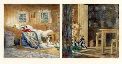
This illustration is an example of unwitting homage and borrowing of ideas.(13 ,14) I know I loved the illustrations by E.H. Shepard, for A.A. Milne’s Winnie-the Pooh as a child. I still do. Here is evidence.


8

The quilt on the bed featured on nearly every page. I tried many plain and patchwork variations. None worked.


so I decided to design one from scratch. Then painted it onto a handkerchief, so I could see how pattern folded etc.


9

The house was based on one featured in ‘The Coalminer’s Daughter’ (film 1980) Dir. Michael Apted) and drawn while watching the film on TV.


10

While in the early stages, we realised we would need more than the usual 12 spreads of a picture book, to get everyone out… and then back into bed. The red rectangles here, from the storyboard show the plotting of an extra 2 spreads. And getting in again!


Ten in the Bed has sold nearly 2 million copies and has been heralded as one of the most popular picture books of recent decades. To celebrate its 30th Anniversary, Illustrationcupboard are currently hosting an exhibition of the original artwork, including entire matching series of working drawings and other reference material. See an artwork preview and discover more about the exhibition on our website.


WIN!


We have three signed copies of Ten in the Bed by Penny Dale available to give away! To enter, just answer this question...


In Ten in the Bed by Penny Dale, who gets a ride in the potty?


To enter, just email your name, address and answer to gallery@illustrationcupboard.com with 'Penny Dale Competition' in the subject line before 1st May 2018. Good luck!


Tuesday, 28 November 2017

The Art of Enchantment

Welcome to our new regular blog feature where we go behind the scenes with our collectors and take a look at some of the the special pieces they've bought and discover why they chose them. This month we hear from Mei, whose enviable collection includes artwork by illustrators such as Angela Barrett, John Vernon Lord, Jane Ray and David McKee:


Beauty looks pensive clutching flowers in her hand, her dress and hair billowing in the wind. At her side looms the magical Beast as a dark green hedge. On the left a stone sculpture with a head of pink roses appears uncannily lifelike. Nothing is as it seems. The dreamy palette of greens evokes a landscape and atmosphere of quietude yet there is tension as if on the cusp of danger. It is a tale as old as time, and Angela Barrett’s rendering of Beauty and the Beast is enchanting. Ethereal. Her delicate brushstrokes of light and shade lend elegance and her pictures poignancy, to a story about love and loss. Richly allusive Beauty Runs Across the Garden is the front cover artwork of a classic fairy-tale retold by Max Eilenberg, whose moving prose touched my heart. I am thrilled it resides in my home.


At the top end of Bury Street in St James’s, lies Illustrationcupboard Gallery, an art gallery devoted to pictures of the most fantastic kind. Even before you step in you can sense something wonderful is about to happen. It is like walking into a storybook - a place full of colour and imagination. Nestled among private gentlemen clubs and posh clothiers, it is unlike the numerous haughty and hardened galleries found in this gentrified area of London. It is an intimate, inviting space. The glass exterior allows daylight to illuminate the tiers of storied artwork that glitter and glide effortlessly along the walls. Your eyes cannot help but dart from one picture to another, greedily absorbing the visual sensations contained within each golden frame. The pictures weave a sort of magic that engages both the heart and mind, and the welcoming staff ensures a pleasurable experience for every visitor.

My encounter with contemporary book illustrations began a year ago at this delightful emporium, a stone’s throw away from Christie’s where I work. With a passion for reading since childhood, combined with a love for beautiful things, this genre of art appealed to my sensibilities. Drawn from narrative, illustrations bring the written word to life. It is collaboration between text and image. They elucidate a story, enriching the reader’s experience giving rise to a wealth of meaning. And so began a love affair with Illustration Art, which, over the course of a year resulted in me collecting ten works by some of the most distinguished English artists.


As a jewellery specialist it was inevitable that the lapis blue in The Children Read by Jane Ray from the book of The Lost Happy Endings first caught my eye. It is a celestial colour. In the picture the nightscape is dotted with gold stars just as the lapis stone is found with gold flecks on its surface. That ultramarine blue reminds me so much of my time as a student in the History of Art. Nostalgia. It became my first purchase. The work is a compact composition of rooftops and houses lit under a night sky and bright moon, and in a contemplative moment I can almost hear the children by the windows.


Another jewel-like illustration I love is Playing Cards Painting Roses Red by John Vernon Lord for Lewis Carroll’s Alice in Wonderland. It is a small image – a miniature, which makes it all the more exquisite. There is something about Lord’s accurate drawing which appeals to my methodical side. The roses delineated in black ink are like the sharp facets of a diamond. Their luscious Pigeon’s Blood hue and drops of ruby-red paint appear to spill over the picture’s threshold. There is a mathematical precision in the artist’s treatment of this subject, yet the world he depicts is a dizzy one. It is contradictory yet beguiling. Dimensions are warped and realities interchangeable. In Alice’s world the cards speak, the croquet balls are hedgehogs and I can walk Through the Looking Glass.


I was lucky to have met some of these award-winning illustrators. Among them David McKee, whose creation of Mr Benn stole my heart. Mr Benn is a well-dressed bowler-hat Englishman - a respectable old-fashioned character whom I find so endearing. Each day he ambles into a fancy dress shop and changes into a different costume to embark on marvellous adventures. The stories are simple and charming. But it is Mr Benn’s sense of morality which resonates having parents who instilled deep values in me from a young age. 007 Benn is Mr Benn dressed in a smart suit as the world’s best-loved spy - James Bond. He is seen in the changing room of the costume shop in all his bravado, holding a gun. I especially love the artist’s depiction of Mr Benn’s multiple reflections in the mirrors. They are like the innumerable prisms of an immense and exquisitely chiselled diamond. It is swagger, a type of cool only an artist like McKee can portray without coming across too cocksure.


John Vernon Lord, a giant in this field, tells us that the purpose of illustration, “... is to enlighten”. From my first picture to this personal reflection the journey has been one of wonder and discovery. If you know John Huddy, proprietor of Illustrationcupboard Gallery, then access to the gallery’s lower ground may be granted, where a rich reservoir of pictures is kept. I am privileged to have had the opportunity to view some of the most exquisite original illustration artwork in this secret chamber. John’s unerring instinct, aesthetic sense and free-flowing thoughts have guided me through this exciting area of collecting. But at the heart of his business is a deep appreciation and conviction for the art he handles. Illustrations illuminate. They offer clarity, allowing us to grasp their stories with heightened awareness and pleasure. Like Giotto’s biblical frescoes in the Arena Chapel it is the art of story-telling in pictures. They elevate our thoughts and fuel our dreams, for the most valuable things in life are those which you cannot see. In their stillness they capture that single moment for eternity. And that is enchanting.


-- Words by Mei Y Giam.